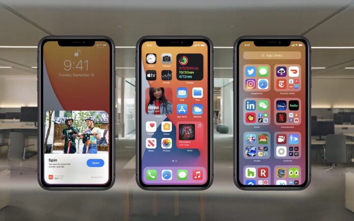
Harvest season is here again, and Apple has deemed iOS 14 (along with iPadOS 14, watchOS 7, and tvOS 14) ready for the picking.
When you decide to take the leap and install—be sure to make a backup first, just in case—here are four features we recommend you check out right away.
App Library
If you’re like us, your first Home screen or two are well-organized, and after that…where did all those apps come from? We find ourselves searching for little-used apps (swipe down on a Home screen) but wish we could see a list of all installed apps. With iOS 14’s new App Library, we can.
A new screen to the right of your last Home screen, the App Library collects all your apps into folders. At the top, Suggestions includes four suggested apps based on time, location, or activity, and Recently Added shows the apps you’ve downloaded lately. The rest of the folders, which, unfortunately, you can’t rename or rearrange, organize apps by category. In a folder grid, tapping a large icon opens that app, while tapping the group of four small icons in the lower-right corner opens the folder. To see an alphabetical list of every app, tap the search field at the top. You can type to narrow the list.

The App Library is tremendously useful because it contains every app and is always in the same place. That enables you to more easily find apps that you’ve removed from your Home screen. It also works well if you choose to hide entire Home screens, another new iOS 14 feature. Note that you can copy apps from the App Library to a Home screen, which can aid in creating your own organizational scheme.
You might even find that you like having just a couple of Home screens and leaving everything else in the App Library.
Home Screen Widgets
Nothing prevents you from whittling your set of Home screens down to just one, but another new iOS 14 feature might encourage you to have a few more. For some years now, apps have had widgets. Widgets are little summary interfaces accessible in Today View, which you access by swiping right on the first Home screen. In iOS 14, you can now place some of those widgets directly on a Home screen.
Widgets come in three sizes: a small square that occupies the space of four normal app icons, a horizontal rectangle that’s the size of two rows of apps, and a large square that takes up the space of four rows of apps.
To add a widget, touch and hold any empty spot on a Home screen, tap the + button in the upper-left corner, and drag the desired widget out to the Home screen, where you can continue to drag it to your desired position. When viewing the widget collection, tap a widget to see all its available sizes.

Right now, most widgets are from Apple apps, but we anticipate many developers adding widgets for their apps in the coming months. You can have as many widgets on a Home screen as will fit, and there’s no problem mixing widgets and apps within the available space. Think about what information you like to get from your iPhone, and then go nuts creating custom Home screens that show what you want at a glance.
Shrunken Siri and Phone Call Interfaces
In previous versions of iOS, when you invoked Siri, the interface completely took over the iPhone screen. It turns out there was no need for that, so in iOS 14, Apple shrunk the Siri interface so it appears at the bottom of the screen, on top of whatever app you’re using. If Siri’s response requires giving you feedback, that appears on top of the current app as well.
Plus, when you receive a phone call, instead of the call taking over the entire screen, you see a dark banner at the top of the screen with red Decline and green Accept buttons. Tap either of those buttons, or tap or swipe down the banner to reveal the full-screen call interface, where you can also tap to answer. Want to delay? Swipe up on the banner to shrink it to a button in the top-left corner of the screen.

These small changes make using Siri or answering phone calls feel much more fluid than the approach of taking over the entire screen.
Pinned Messages Conversations
We all have individuals and groups that we converse with regularly in Messages. It’s frustrating to hunt through the list of conversations to find them, so iOS 14 adds the concept of “pinned” conversations. Touch and hold on any conversation in the list to bring up a preview of the last few messages and some commands. Then tap Pin to add the conversation to the top of the Messages screen as a circular icon. From then on, tap that icon to enter the conversation quickly.

iOS 14 sports many other features as well, and we’ll be sharing more about them in future articles. Remember, it’s worth waiting a bit to install, and note that iOS 14 is compatible with the iPhone 6s or later, including the first-generation iPhone SE, and the current seventh-generation iPod touch.
(Featured image by Apple)

